


This project focused on improving how movers transfer their internet service when relocating to a new home, making the process more intuitive.
In the previous flow, users were sent to the provider’s website in a new browser tab to complete the transfer. This abrupt redirection led many users to drop off before returning to the MYMOVE platform.
To solve this, we redesigned the experience to keep users on the platform throughout the journey. This made the process smoother and helped increase engagement and conversions.
Role
Team
Platform
Timeline
MYMOVE is the exclusive partner of USPS, connecting brands with over 28 million movers each year.
MYMOVE helps millions of Americans simplify their move by providing essential tools in one place, from submitting a Change-of-Address to setting up internet and updating insurance.
One of these key experiences is the Broadband flow, which allows movers to check internet availability at their new address and easily transfer or choose a new provider within the MYMOVE platform.

The existing broadband flow disrupted the user journey and had a negative impact on retention and conversion. The broken flow reduced completion, ultimately lowering impressions, engagement, and potential conversions within the Broadband experience.
01. Unintuitive broadband transfer flow
When users chose to transfer their internet service, they were redirected to the provider’s website in a new tab. This broke the flow and created uncertainty about next steps, causing many to abandon the process before returning to MYMOVE.
02. Lack of personalization
03. Inconsistent visual experience

Through design sprint for brainstorming and research, we identified the need to streamline the Internet transfer process. The key insight was to keep the entire experience within the MYMOVE platform, allowing users to complete the internet transfer process without leaving the site.
Ensure that the entire journey is intuitive and uninterrupted, focusing on simplifying processes and minimizing friction for a smooth experience.
Leverage user data to deliver relevant content and follow-up communication, making the experience more efficient and engaging.
Maintain a cohesive, visually appealing design that reinforces trust and brand recognition across all touch points.
To reduce drop-off and create a smoother experience, we redesigned the user flow to keep users within the MYMOVE platform. A key improvement was the introduction of a call center step. It enables users to complete their internet transfer seamlessly without navigating away to a provider’s site.

Before: Users had to leave the platform and complete transfer on the provider’s site → drop-offs and low visibility
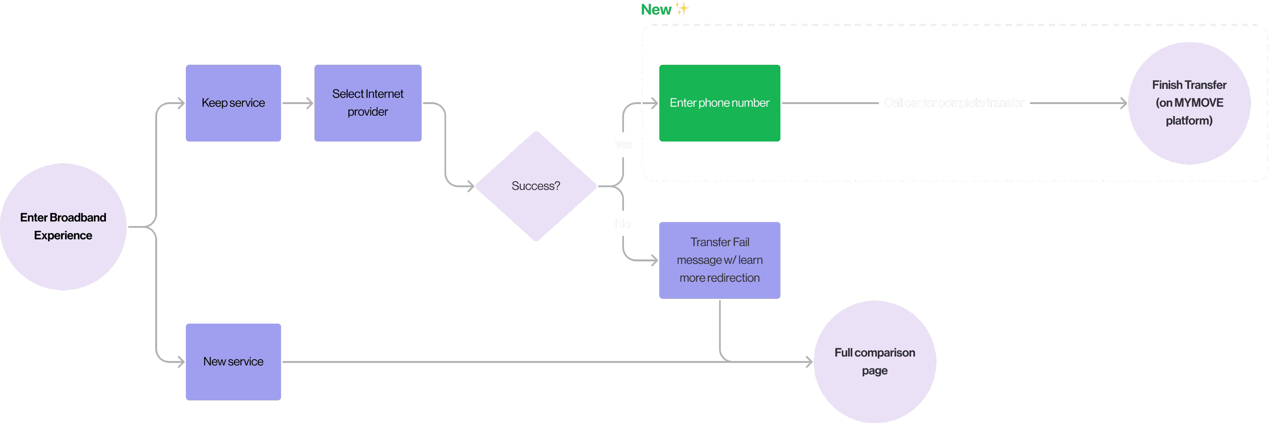
After: Users stay on the same platform and provide phone number → call center completes transfer, reducing friction
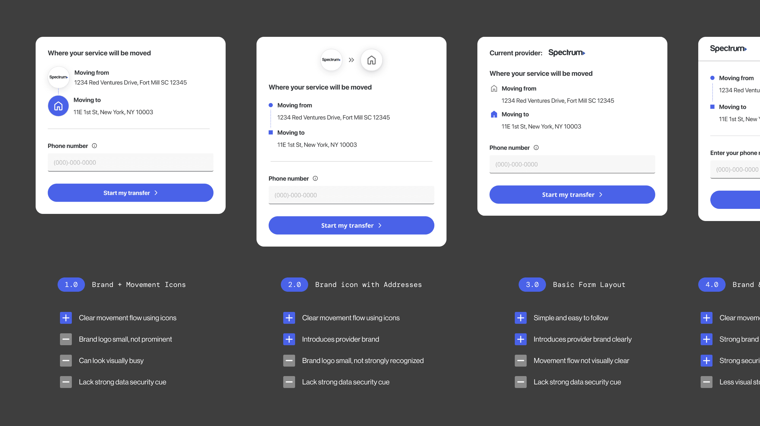
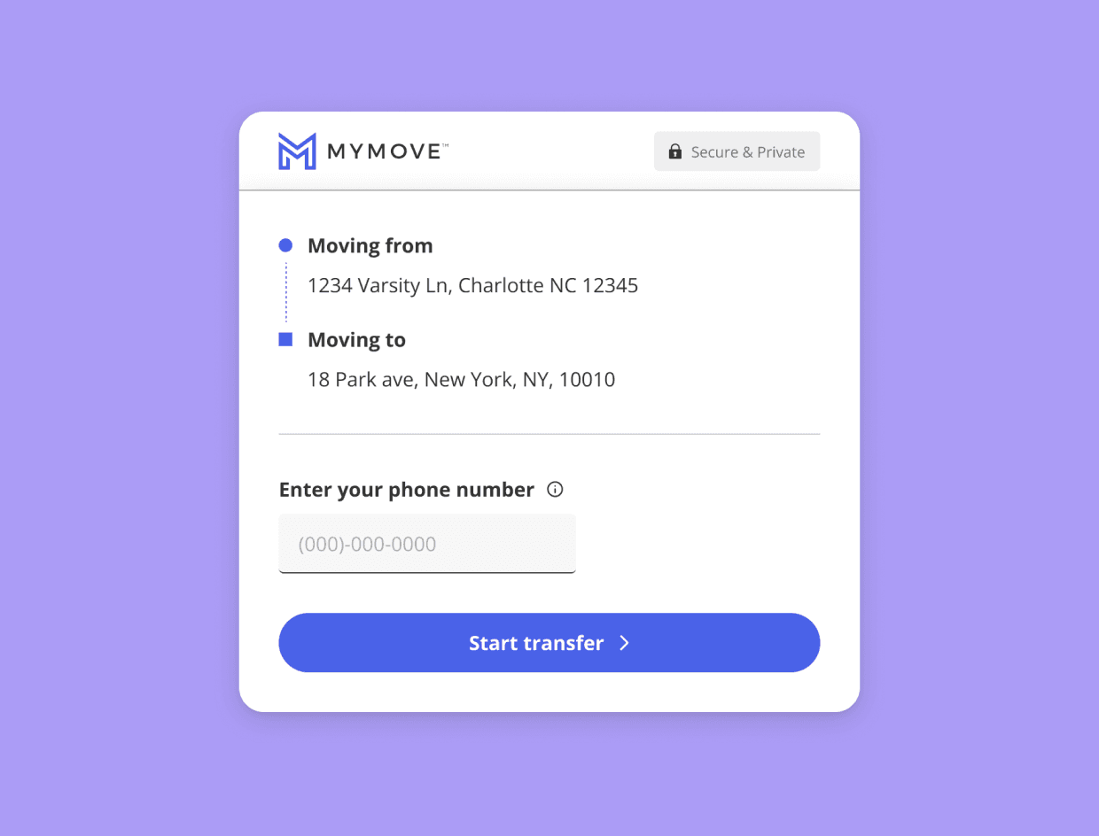
With the call center step added, we needed a way to enter user's phone number along with internet provider and address to make seamless transfer process.
I rapidly designed and tested over 15+ high-fidelity prototypes, exploring different layouts and placements for the input field. The goal was to add the phone number step naturally without making the form feel heavy.
Throughout this process, I worked closely with designers, engineers, and product managers to find the best solution.

The Broadband redesign resulted in a significant improvement in user engagement and conversion. We achieved the following key outcomes:
%
+
10
9
8
7
6
5
4
3
2
1
%
+
10
9
8
7
6
5
4
3
2
1
Cross-team collaboration creates stronger solutions
This project brought together two teams with different focuses. Through close collaboration, I learned to approach challenges from multiple perspectives and to balance user needs with business goals.
I also realized how much honest, consistent communication shapes better outcomes. The more openly we discussed ideas and constraints, the more creative solutions became. This experience reminded me that good design happens when teams work together with shared goals.

Enhancing Color Palette in a B2B SaaS Dashboard