UX design internship at Samsung Research America (SRA)

PROJECT OVERVIEW

During the summer of 2023, I interned as a visual/UX designer in MPS B2B UX team at Samsung Research America in Mountain View, CA.

MY ROLE

· Developed color palettes utilized by all products in Knox cloud solution, which is a B2B SaaS platform to manage over 70 million devices.
· Conducted research on web accessibility based on WCAG 2.0 compliance and set design system to standardize color palette usage across the teams
· Created concept design to improve layout and charts of KAI, which is cloud-based data analytics tool of Knox with data visualization capability.

COMPANY

Samsung Research America

Team

MPS B2B Solution Lab UX team

Timeline

May ~ Sep 2023(14 weeks)

Tool

Figma, Jira

OVERVIEW

In the summer of 2023, I joined the MPS B2B solution Lab, UX team at Samsung Research America(SRA) in Mountain View, CA. During my 14-week internship, my assigned case was to improve an optimized color palette and color guideline for data visualization and create a concept design for enhance individual charts and layouts on the Samsung Knox Cloud Solution(KCS) dashboard.

Due to NDA, I cannot share every detail of my work, but if you would like to learn more about the project, feel free to reach out to me.

What is Knox Cloud Solution (KCS)?

Samsung Knox is a business platform for configuring mobile devices offering efficiency in various industries. Knox Cloud Solutions allows businesses to customize, deploy, analyze and manage their mobile devices. This improves business performance and supports workers in greater productivity and efficiency, in-office or out in the field.

Problem statement

Diverse data visualization colors have been utilized across the dashboard in KCS products. However, this approach has led to several challenges that need to be addressed for improved accessibility and user experience.

Lack of Accessibility

In the below example, current data visualization colors failed to meet a 3:1 color contrast ratio against their background, posing accessibility challenges for users with varying visual abilities.

Inadequate Contrast

The existing sequential color palette lacks sufficient contrast, as demonstrated in the example below. With multiple similar shades of blue, it becomes challenging for users to differentiate between different data points.

Limited Documentation and Guidelines

The current design system lacks comprehensive documentation and guidelines for color usage, creating inconsistencies and ambiguity in color selection and application across various data visualization contexts.

objectives

Establish an official categorical and sequential color palette for the KCS products' dashboard to improve accessibility and visual consistency. And create comprehensive color guidelines for consistent usage across various data visualization scenarios.

research

I conducted research for 7+ established color design systems. The research goal was to gain a better understanding of categorical and sequential color and to determine the best way to build the accessible color palette for data visualization.

What can we improve

01

Visualization

Improved color choices can enhance the visualizations’ readability and seamless understanding of information
02

Accessibility

Emphasize the importance of accessibility in color palette selection
03

Consistency

Reinforce the need for consistency including brand color in usage across charts
04

Clarity

Ensure that the color usage guideline provide concise instruction on how to use the color palette effectively

Accessibility and categorical color

Selecting categorical colors presented a challenge. Beyond defining the color palette, the sequence in which colors are applied to represent data sets significantly impacts accessibility.

Categorical color

After a lot of wrestling and iteration, I landed on a solution to create categorical color palette.

The categorical color palette consists of 12 carefully selected colors to distinguish categories visually. The categorical color palette offers district colors that can be applied to represent different categories or groups. The spectrum categorical 6-color palette has been optimized to be distinguishable for users with color vision deficiencies.

Evaluating the categorical palette

With the adjustments, the categorical palette is 3:1 contrast-accessible against background. I used to WebAIM: Web Accessibility In Mind to evaluate our results. Categorical palette ensures sufficient color contrast so that people with low vision can see and use the dashboard in KCS.
The left side is attempt #1, and the middle is attempt #6. Comparing these two attempts colors, the contrast ratio in the final colors significantly meets WCAG 3:1 contrast ratio.

Additional accessibility cues for the categorical palette

Although I tried all the colors that are 3:1 contrast-accessible against the background, it is challenging to keep them all accessible to enhance the visualizations’ readability.

For additional accessibility, the divider line is more important in charts using the categorical palette because colors are used here to differentiate between categories.

Also, hover tooltips are necessary to communicate more detailed information without overcrowding the visualization. KCS data visualization color has tooltips to enhance visual distinction and ease of recognition.
Divider line on pie chart between categories
Tooltip on a single data

Sequential color

The sequential color palette is designed to visualize high to low values for different measures. The sequential color palette of 10 colors derived from the Samsung One UI blue color is ideal for representing progressive data. Its visually cohesive range enables clear data visualization from low to high or in a specific sequence.

Documentation
— Usage guideline

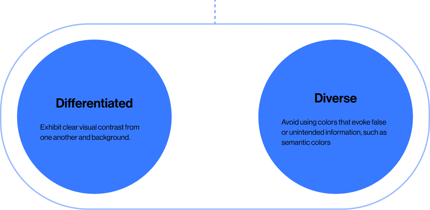
The color usage guideline can provide a clear framework for consistent and effective color utilization in our data visualization.

What I learned from the internship at SRA

Designing together
As a UX design intern at a big tech company, I realized that many people have been spending time to solve users’ problems. They have reviewed data, iterated prototypes, and discussed constantly.

Asking and listening to them, I learned much more than I could have discovered in 14 weeks. I could get great feedback about how well my suggestions could improve users’ and businesses’ needs. I felt lucky to have been surrounded my supportive and passionate people, and I enjoyed working with them.
Accessibility and Effective Communication through Color
I deepened my understanding of the connection between color contrast and accessibility in design. I recognized the importance of creating inclusive visuals catering to diverse users. I also discovered how the strategic use of color can significantly enhance data communication by guiding users' attention, emphasizing crucial information, and understandably presenting data.

Up next