


This project began as a design assessment for Red Ventures interview, where I was asked to redesign Spotify’s Premium plan page.
At the time, my focus was on simplifying comparisons and making the plans easier to scan. After working at Red Ventures for over a year, I revisited the same challenge as a side project to demonstrate my growth. Drawing from my experience in conversion-focused design, data interpretation, and accessibility, I redesigned the page again.
By comparing the two redesigns, before and after my industry experience, I was able to showcase how my design thinking and craft have evolved.
Role
Type
Tool
Timeline
First version: July 2024
Second version: September 2025
This project began as part of a design assessment during my interview with Red Ventures. After joining the company and gaining hands-on experience with large-scale consumer products, I revisited the redesign as a side project to showcase how much I’ve grown.
During my interview assessment, I approached the problem with fresh eyes, focusing on how to simplify and clarify Spotify’s Premium Plan experience.
User Research
Conducted quick user interviews with two non-Premium Spotify users to understand usability issues and identify what made choosing a plan difficult.
Key Insights
Design Direction
Created a cleaner layout with stronger hierarchy, brought visual storytelling through imagery, and restructured benefits and plan cards for easier scanning.
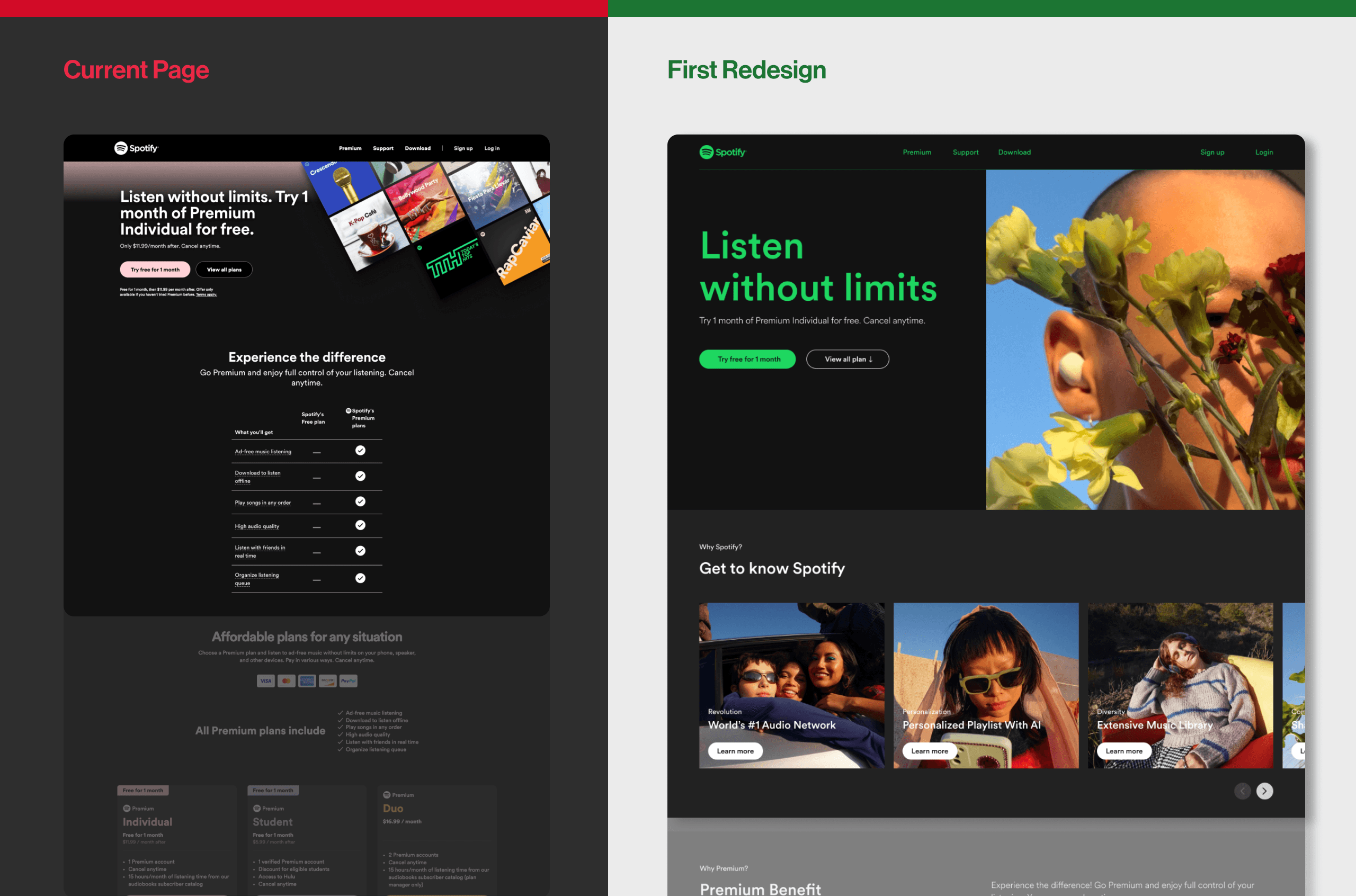
The original header was text-heavy and difficult to scan. I simplified the copy to highlight key messages and improve clarity. I also introduced a bold, vibrant visual to reflect Spotify’s brand and make the entry experience more engaging. Lastly, I added a new “Why Spotify” section to emphasize personalization and diverse content, helping users understand Spotify’s unique value.
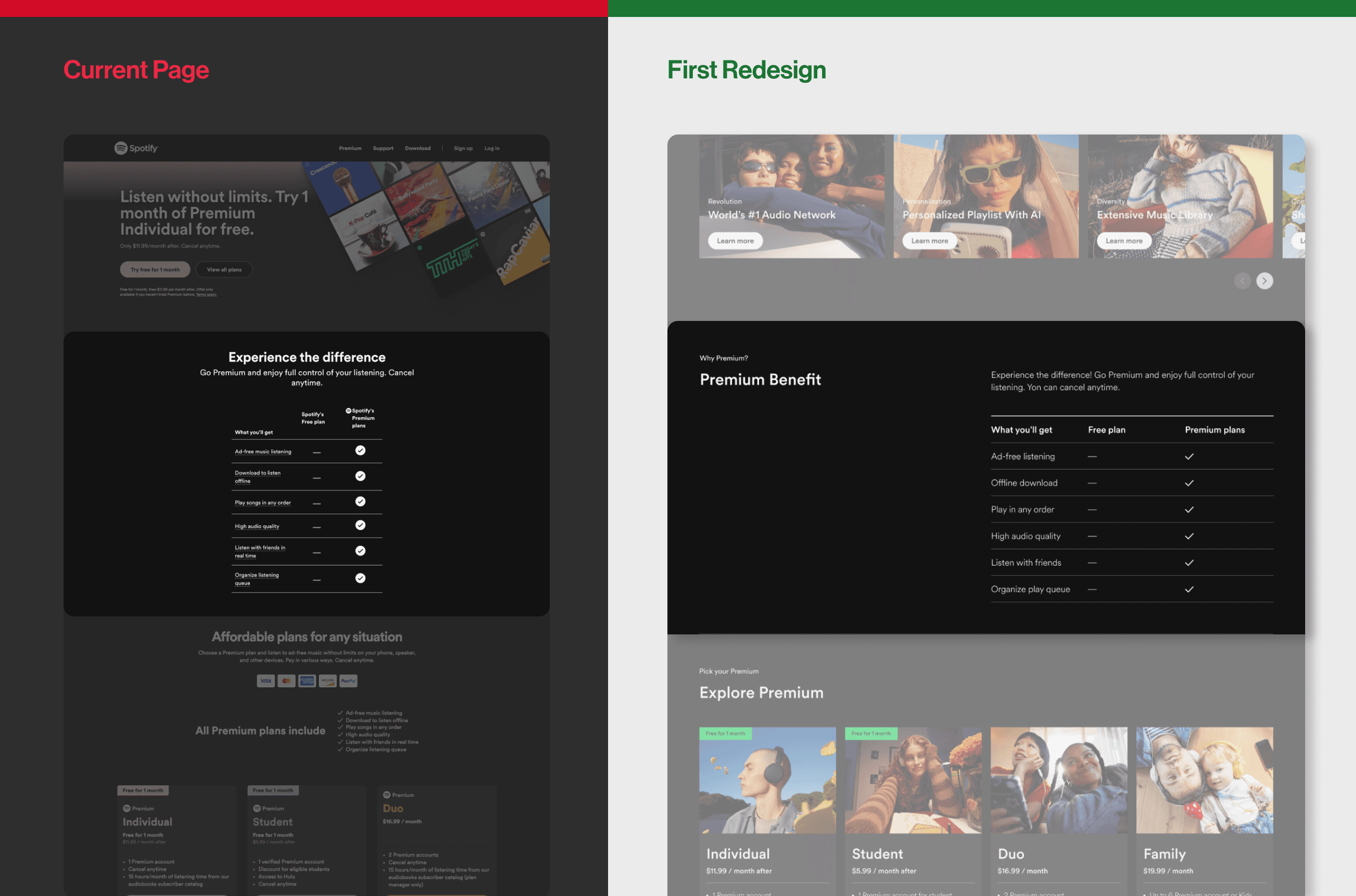
Next, I redesigned the Premium Benefits section to improve readability and engagement. I aligned section titles to the left and placed descriptions on the right, creating a clear visual flow that follows users’ natural left-to-right reading pattern. This structure helps users scan information more quickly.
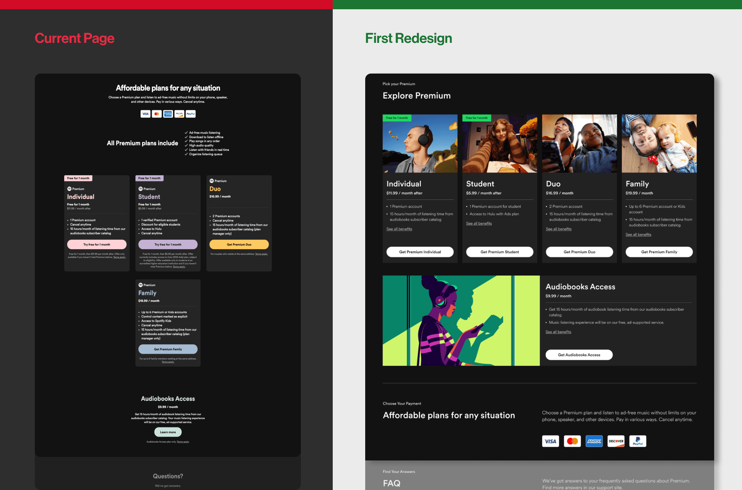
For the Premium plan section, I strengthened the visual hierarchy to make comparison easier. In the original design, key details were scattered, making it difficult for users to evaluate plans quickly. I reorganized the information to ensure consistency, allowing users to compare benefits side by side and make decisions faster. To make each plan more relatable, I added representative visuals such as a student for the Student plan, helping users instantly recognize the plan that best fits their lifestyle.
After a year of designing for a large-scale platform that serves millions of users, my design process evolved significantly. I began to think more strategically about how design decisions impact both the user experience and the business.
01
I learned how to balance user clarity with monetization goals, ensuring that each design not only improves usability but also supports key business outcomes.
02
03
I deepened my focus on accessibility, responsive behavior, and scalable UI systems, creating designs that feel cohesive and adaptable across different devices and use cases.
When I revisited this project, I applied what I had learned from designing for large-scale consumer products:
Streamlined Layout: Reduced page length and simplified content to create a more focused decision flow. It helps improving conversion and user retention.
Clear Hierarchy: Moved the pricing section to the top and organized information in a logical order to support easier comparison.
Visual Benefits Grid: Replaced dense text with concise, visual cards that make Premium’s advantages instantly understandable.
AI Integration Concept: Explored an interactive “Ask AI about Premium” feature to help users find the best plan through conversation.
Design Quality: Focused on accessibility, responsiveness, and maintaining Spotify’s distinctive brand expression.
Reflection
Revisiting this project after a year allowed me to see how much my approach to design has evolved.
In the first version, I focused mainly on visual improvements and clarity. This time, I approached it with a more strategic mindset, considering user behavior, decision flow, and how content hierarchy affects engagement.
Through this process, I realized how important it is to design with both users and business context in mind, while keeping the experience simple and meaningful.
Enhancing Color Palette in a B2B SaaS Dashboard